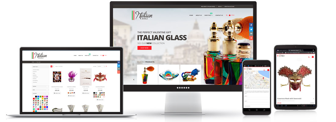
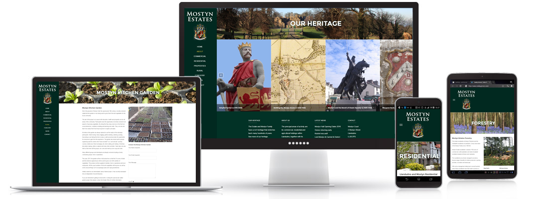
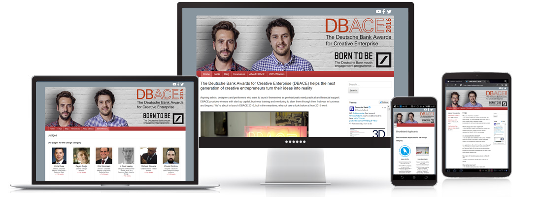
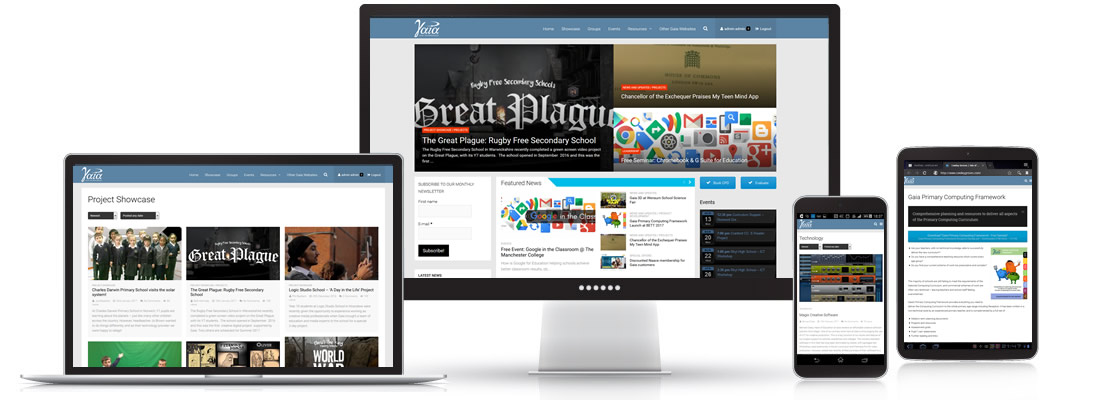
Responsive Web Design means we can develop your website so that it is optimised for a wide range of devices. Responsive websites change width and layout depending on browser/device size.
Responsive Websites adds another dimension to the design considerations, where each screen size design needs to be optimised. Our designers are used to working with these design permutations and will be consistent in quality across all the presentations.
This website is using a responsive design. If you are using a desktop computer please try resizing your browser.
Visits to retail websites via mobile devices have overtaken desktop traffic for the first time, figures show.
Some 52% of visits were made via a mobile, while 36% of UK online sales are now completed on a smartphone or tablet device – rising to 40% for clothing sellers.
Of sales completed on a mobile device, smartphones account for around 18% and tablets 82%.
IMRG Capgemini Quarterly Benchmarking Report


